A musicologist's guide to Sonic Visualiser
By Nicholas Cook and Daniel Leech-Wilkinson
In order to work through these training materials, you will need to download and install a freely available program called Sonic Visualiser, and also some files specifically for use with these materials. Links, files, and full instructions may be found here. A print-friendly version of this tutorial is also available in pdf format (2.1MB) (pdf file).
You don't need special techniques to analyse recordings: important work has been done using nothing more complicated than a CD player and a pencil to mark up a score, or a stopwatch to measure the duration of movements or sections of them. But it's possible to make your observations more precise, to sharpen your hearing, and to explore the detail of recordings by using simple computer-based techniques. This document introduces a range of them and their uses, though it doesn't attempt to teach you everything you need to know in order to use the programs mentioned—for this you will need to refer to their user guides and help screens. All programs run under Windows (Audacity and Sonic Visualiser are also available for Linux and Mac OS/X), can be downloaded from the web, and are free. Remember that urls can change: if those given don't work, try Google.
Basics
To take advantage of computer-based techniques of analysis you first need to copy the recording to your hard disc, for instance by ripping it from CD using a program such as Freerip; as mp3 files are significantly lower in quality than wav, use the latter format whenever possible.
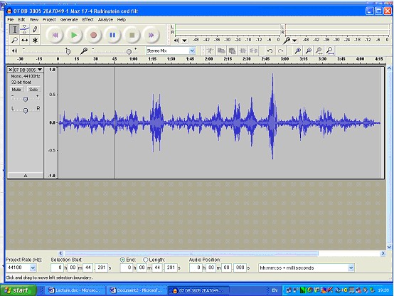
Sometimes you will need to edit the sound file, for instance if you want to work on only part of it. For this you need a simple sound editor such as Audacity. If you don't have one, install Audacity now, and open any .wav or .mp3 file in it (there are several in the files you downloaded for this tutorial). Explore the program's various features, which include not only playing and editing the recording but also a number of other functions. One is file conversion: if you have a wav (CD quality) file and want to turn it into an mp3 (for emailing, or use in a mp3 player), select 'Export as MP3', while if you have a mp3 file and want to turn it into a wav file, then Audacity will do that for you too. (Remember however that when you turn a mp3 file into wav, the sound quality doesn't improve.) Again, you can turn a stereo recording into a mono one (there's no point in having stereo tracks if you're working on CD transfers from 78s): to do this, open up the drop-down list with the track name, select 'Split Stereo Track', delete one of the resulting mono tracks, and select Mono from the drop-down list. It will now look something like the screen shot below. And if you are working with a number of files recorded at different levels, you can use the 'Amplify' effect to change the volume (you'll find it under the 'Effect' menu). Audacity also offers a range of features for navigating and visualising recordings, but not as many as Sonic Visualiser, of which more shortly.
-
- Sonic Visualiser graph 1
The standard waveform representation used in Audacity and other sound editors is a symmetrical graph of loudness (volume) against time. It's convenient for finding your way around a sound file, because you can often see note attacks or sectional breaks, but it's not very useful as a means of analysis; there are other ways of visualising music which reveal more about what we hear. This tutorial describes two basic approaches: the first involves extracting and displaying information about performance timing and dynamics, while the second involves the use of spectrograms to focus in on the detail of the music. Sonic Visualiser supports both of these approaches. But it also has major advantages as an environment for navigating recordings, so we shall begin by describing these.
Using Sonic Visualiser to navigate recordings
Recently developed at Queen Mary, University of London, Sonic Visualiser is a program specifically designed for analysing recordings. (If you haven't yet installed it, follow the instructions in the text box at the top of this document.) Just to outline the basics, it's like Audacity in that it displays the waveform, and you have the usual stop, go, and pause functions for playback, together with some more sophisticated options. (You can explore them under the 'Playback' menu.) But Sonic Visualiser is not a sound editor: instead, as the name implies, it's designed to offer different ways of visualising the music as you hear it. It's based on the idea of transparent layers overlaid one on the other; one layer will be the sound wave, but others will be different visualisations, text associated with the music, and so on. (The tabs at the right of the screen bring different layers to the top, together with the controls associated with them. You can explore the different layers available by looking under the Layer menu.) Another key concept is panes: each set of layers is called a pane, and you can have two or more different panes arranged from the top to the bottom of the screen. (Again you can explore what is available by looking at the Panes menu.) Much of Sonic Visualiser's functionality derives from the plug-ins from third-party developers available for it (these are displayed under the Transform menu). Add the set of tools on the toolbar, and a range of import and export facilities, and the basics are covered. We can't replicate all the instructions for using Sonic Visualiser in this tutorial; instead, consult the Reference manual available on the Sonic Visualiser website (or via 'Help' from within the program).
-
- Sonic Visualiser graph 2
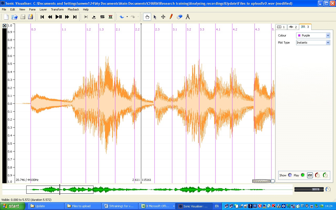
Open Sonic Visualiser, if you haven't already, and load r0.wav, which is one of the files you should have downloaded along with Sonic Visualiser (File > Import Audio File); it's the first 16 bars of Chopin's Mazurka in F# minor, Op. 6. No. 1, as recorded in 1939 by Artur Rubinstein. Once the file has loaded you'll see something like the screenshot above. Take the time to experiment with the program a little; play the example, using the icons on the toolbar or alternatively the space bar. (If you prefer the music to scroll as it plays, set 'Follow playback' at the right of the screen to 'Scroll'.) Observe how you can drag the waveform backwards and forwards; the little waveform and box at the bottom allows you to move across the entire recording. Try dragging on the knurled wheels at the bottom right and see what happens. Click on the second of the tabs at the right of the screen, which brings up the ruler layer (if you don't want this you can click on the 'Show' button at the bottom, or left click and delete the layer), and then on the third, which is the waveform layer: try changing its colour (orange is good because black lines show up well against it). On the toolbar, click the button with the upward pointing arrow (the fifth from the right): you are now in Select mode, and can select part of the recording, just like in Audacity. If on the Playback menu you now select 'Constrain Playback to Selection', that's all you'll hear. Right click and 'Clear selection'; click the pointing hand to the left of the Select icon to take you back to Navigate mode, and once again you'll be able to drag the waveform backwards and forwards. You're rapidly gaining a sense of where the most important controls lie.
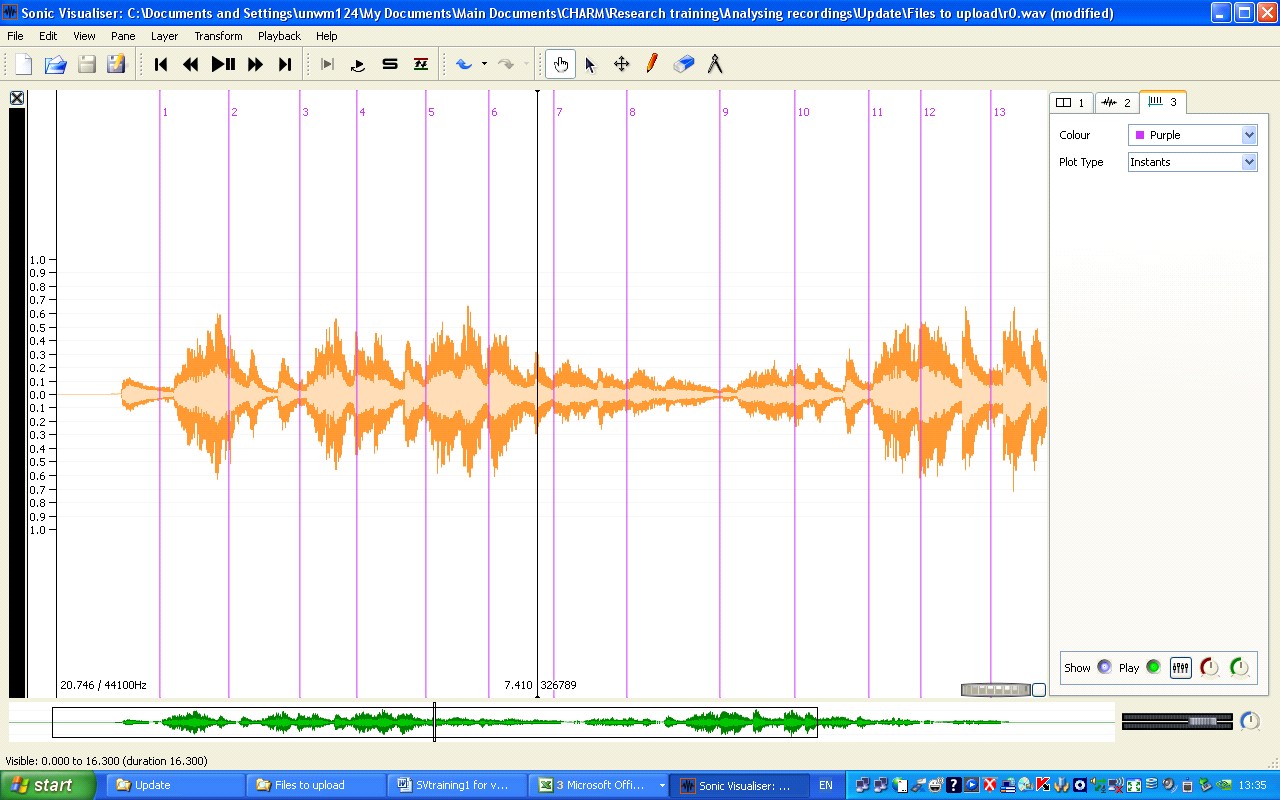
Sonic Visualiser allows you to move easily around a recording, but for purposes of analysis it would be very helpful to know where each bar begins; then you could move directly to a particular point in the music. Adding barlines is easily done. Before you begin, open Edit > Number New Instances with, and check that Simple counter is selected. (This is just so that the barlines are numbered correctly.) Now play the music, and as it plays, press the ; (semicolon) key at the beginning of each bar. (If you want a score of Op. 6 No. 1, you can download it from here.) You should end up with something like the screenshot below: if you want to examine the file this came from, open r0bars.sv. Did you get the barlines in the right places? Play the music back, and you will hear clicks where you put the barlines. (You can turn the clicks on or off using the Play button at the bottom right—this is a control for the new layer that Sonic Visualiser created when you started tapping. Note that this is called a 'Time instants' layer—if you mouseover the tab it will tell you so, and the symbol on the tab also identifies it as such.) If the clicks aren't in the right place, go into Edit mode (click the cross icon on the toolbar, to the right of the arrow one), put the cursor onto the offending barline, and simply drag it backwards or forwards until it's correct. Go back to Navigate: now you can again drag the music backwards or forwards, to check if you got it right.
-
- Sonic Visualiser graph 3
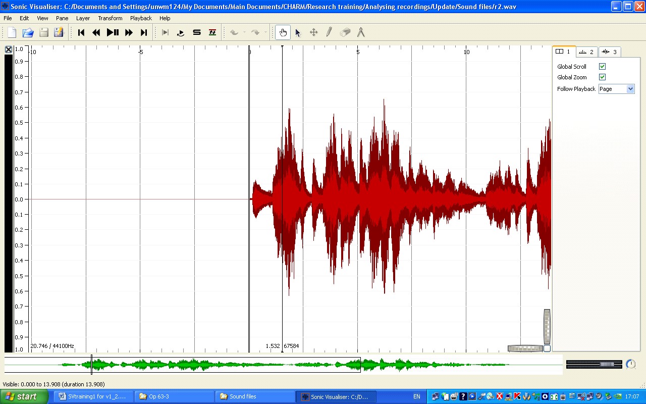
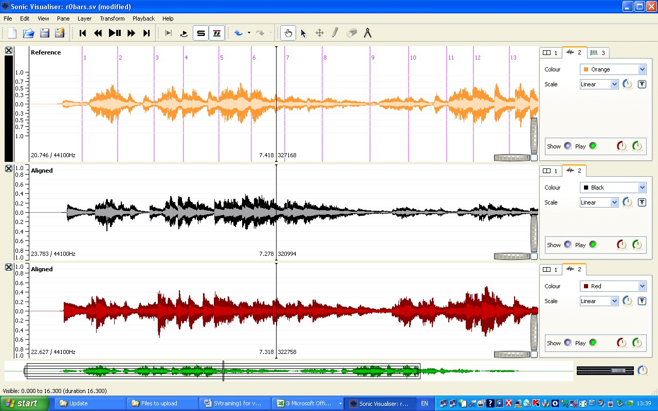
One of the best ways of analysing recordings is by comparing different recordings of the same piece, and Sonic Visualiser has a very powerful feature that enables you to navigate across a number of recordings. Let's say we want to compare how Rubinstein played Op. 6 No. 1 in his 1939, 1952, and 1966 recordings. Click on File > Import secondary audio file, and load first r1.wav (that's the 1952 recording) and then r2.wav (1966). Each will open in a new pane; if you have set the 1939 recording to scroll, then do the same with each of the new recordings. (If instead of putting it together yourself you want a file that contains all of this, open r012.sv.) Now comes the clever bit. Click on the 'Align File Timelines' button (it's a few buttons to the left of the Navigation button, just to the right of the one that looks like 'S'). The computer will work for a few seconds, and the three recordings will be aligned. Press play. You will hear whichever of the three recordings has a black bar next to it at the extreme left of the screen. As the music plays, click on one of the other recordings: almost immediately you will hear the music continuing, but in a different recording. The fact that the recordings are locked together means you can use the bar numbers you inserted in the 1939 recording to navigate any of the recordings: drag the top pane to start at bar 9, but select the 1952 or 1966 recording before pressing play. Go back to Select mode and select bars 9-12 (if the layer with the barlines is still on top, Sonic Visualiser will automatically select whole bars); from the Playback menu select 'Constrain Playback to Selection' and 'Loop Playback'. Now you can listen continuously to just those bars, swapping between one recording and another.
-
- Sonic Visualiser graph 4
After all this, you might not want to throw away what you've done when you quit the program. If you save the session (File menu or toolbar icon), then you can reload everything—the three recordings and the barlines—in one operation. After opening the file you will need to press the 'Align File Timelines' button again.
Visualising tempo and dynamics on screen
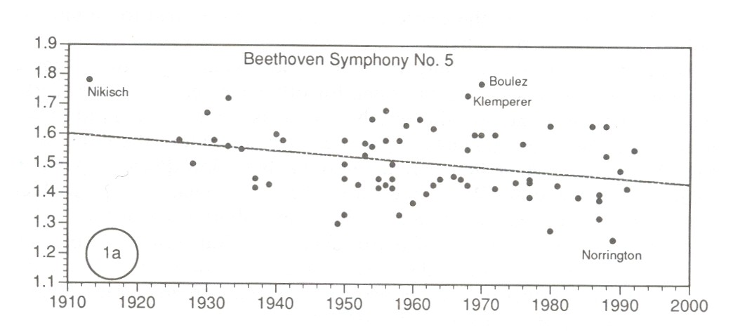
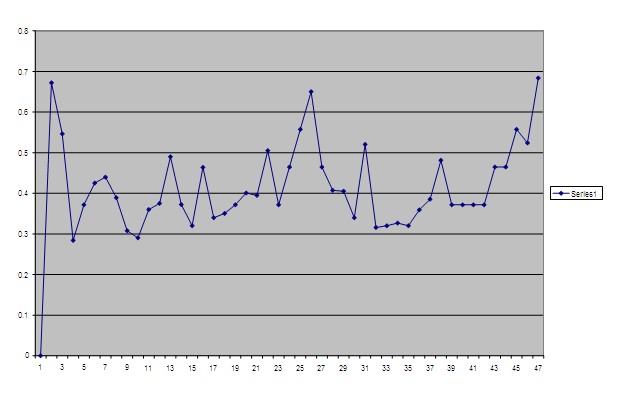
As already stated, you can study performance timing using nothing more complicated than a stopwatch. The chart shown below, from José Bowen's article 'Tempo, Duration, and Flexibility: Techniques in the Analysis of Performance' (Journal of Musicological Research 16 [1996], 111–56) required no more than that: the vertical axis shows the duration of the exposition of Beethoven's Fifth Symphony (in minutes), while the horizontal axis shows the date of the recording. There's a lot of scatter, but on average the music is getting faster (as shown by the trend line).
-
- scatter graph 5
But it's possible to look at performance timing in much more detail. In principle the obvious solution would be to run a programme that detected each onset in the recording and marked them. In practice there isn't yet technology that will do this reliably, although people are working on it and this statement may need revising before too long. One of the third-partly plugins for Sonic Visualiser, Aubio Onset Detector, makes a decent stab at detecting the note attacks in Op. 6 No. 1 (to try it for yourself, load r0.wav, then select Transform > Analysis by Plugin Name > Aubio Onset Detector > Onsets, and click OK to accept the default settings). But it still misses some notes and/or finds spurious ones. One way round this is to look for the onsets on a spectrogram, and we'll be coming back to this later in the tutorial: this is a viable approach, at least for some music, but time-consuming. For this reason, studies of performance timing—at least by musicologists—have tended to focus on tempo, that is the fluctuating patterns of the beats (this only makes sense for music that has something identifiable as a beat, of course). The traditional approach is to listen to the music while tapping on a computer keyboard, with a program that logs the times when you tap; you then import the timings into a spreadsheet and turn them into a tempo graph, that is, a graph with time (for instance in bar numbers) on the horizontal dimension, and tempo (for example in MM) on the vertical dimension. Since tempo is an important dimension of performance expression, at least in most styles of classical music, this provides something of a shortcut to analytically significant aspects of the performance.
Traditionally, this approach has suffered from two problems: it's hard to be sure how accurate the timing measurements are, and it's hard to relate the resulting tempo graphs back to the music as you listen to it. Sonic Visualiser helps overcome both these problems and makes the tapping technique much more reliable than it used to be. We'll continue working with Rubinstein's 1939 recording of Chopin's Op. 6 No. 1, so have it open (r0.wav). We'll be doing exactly the same as when creating barlines, except that this time we shall be tapping on each beat—each, that is, except the first, since there's no way of knowing exactly when that will come. As before, play the music and press the ; (semicolon) key for each beat. (If you are working on a desktop computer, you can use the numeric enter key.) It may take a few goes (you can simply delete the Time instants layer containing the beats and start over), or you might try rehearsing it once or twice before doing it for real, but you should end up with something like the screenshot below.
-
- Sonic Visualiser graph 6
But now there are three problems that need addressing. First, we are missing the initial upbeat. We can add that by eye and then check it by ear: click on the pencil icon in the toolbar to go into Draw mode, position your cursor at the beginning of the first note, and click again. A line will appear.
Second, as in the case of the barlines, you may not have got the position of the beats quite right. As before, listen to the clicks, then go into Edit mode and drag the beat lines backwards or forwards until they're right; as you do this, you will need to alternate between Edit mode and Navigate mode. Sometimes, as with the initial beat, the waveform is a good guide to where the beat should be, but sometimes it isn't; you need to use both eyes and ears. (If in doubt, favour ears.) If you find a beat line that shouldn't be there at all, click on the erase button (next to the pencil), and then on the line which will disappear. If you find it hard to get all this right, try slowing down the playback speed by using the circular knob at the very bottom right of the screen, with the mouseover label 'Playback Speedup': you can drag it clockwise or anticlockwise (the extent to which you are slowing down or speeding up the playback will be shown at the bottom left of the screen), or double click on the knob and type in the value you want (try '-50' to start with). It may take time, but through this editing and listening you can end up with beat values that are much more reliable than was possible before Sonic Visualiser.
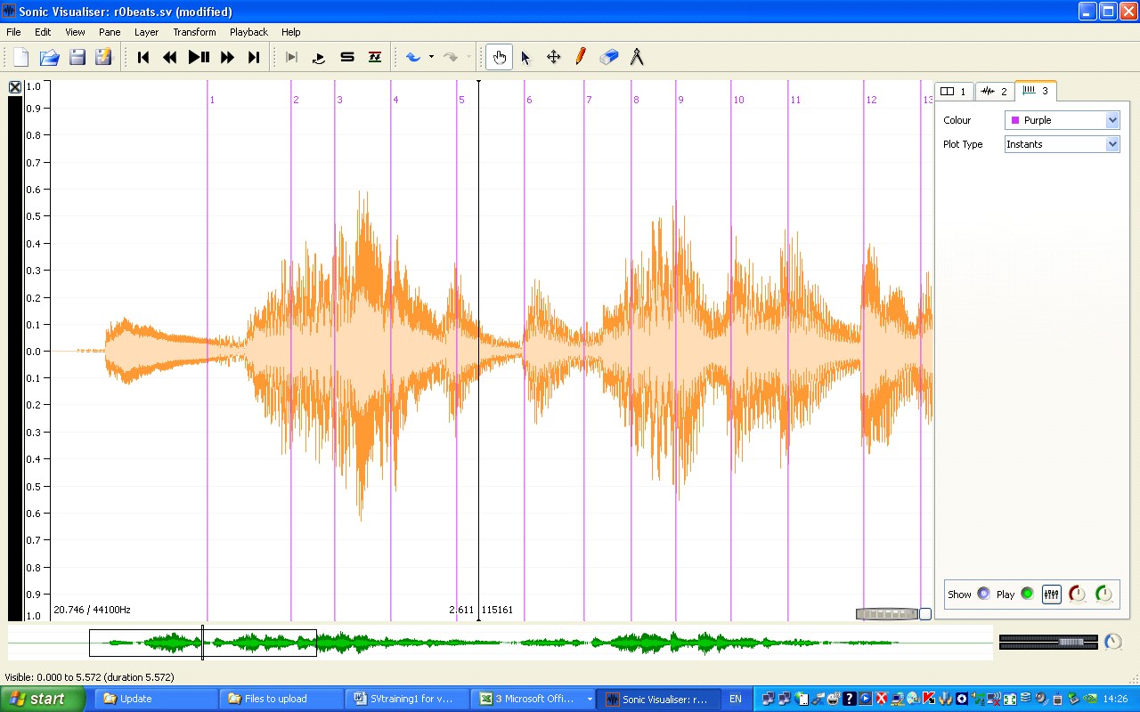
Third and last, the beats will almost certainly not be numbered as you would wish. Sonic Visualiser can number them by bar:beat, which is extremely convenient (and means it's not necessary to tap the bars separately), so it's worth learning how. Make sure the Time instants (beats) layer is on top. Select 'Number New Instants with' from the Edit menu, and then 'Cyclical two-bar counter (bar/beat)'; then set 'Cycle size' to 3 (since mazurkas have three beats in the bar). Now consider how we want the first beat numbered. It's an upbeat, so we want the label to be 0:3. Open Edit > Select Numbering Counters; set 'Course counter (bars)' to 0, and 'Fine counter (beats)' to 3. Now 'Select all', and then 'Renumber Selected Instants' (still from the Edit menu). Everything should look how you want to be, except that if not all the numbers appear, drag on the knurled wheel to space the music more widely. You should now have something like the following screenshot. It would be a good idea to save the session at this point. (Alternatively, if you want to see the session file from which the screenshot is taken, open r0beats.sv.)
-
- Sonic Visualiser graph 7
Having created the beat data, you can now easily turn it into a tempo or duration graph and display it in Sonic Visualiser. Here's how. Again, make sure that the Time instants layer is on top. Then select all, copy, create a new Time values layer (from the Edit menu), and paste. A dialog box opens, offering you a number of choices. If you want a tempo graph, with higher meaning faster, choose 'Tempo (bpm) based on duration since the previous item'. (In either case the value next to, say, the label '4:3' will reflect the length of the beat the ends there, that is to say the distance between 4:2 and 4:3; this will seem more natural if you think of the labels as marking the beat equivalent of barlines, not points. The reason for doing it this way is that is makes the graph fit much more intuitively with the sound of the music - after all, it's only at the end of a beat that you know how long it is. If you don't like this, you can choose tempo or duration 'to the following item', but the graph will no longer fit the sound. Click OK, and before you do anything else, make sure you are in Navigate mode (because in Edit mode, clicking in the window alters the graph). Now adjust the graph to improve its appearance, for instance by setting Colour to black and Plot type to lines, and by clearing the selection. If you chose tempo, then it should look more or less like the screenshot below. (The display of the layer controls on the right has been turned off, by unticking View > Show property boxes.) Note that the scale on the left shows metronome values: the scale shows the values associated with whichever layer is on top.
-
- Sonic Visualiser graph 8
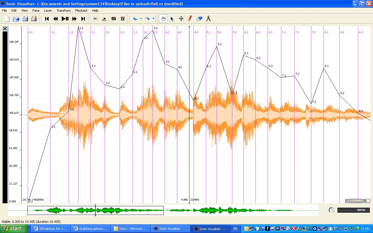
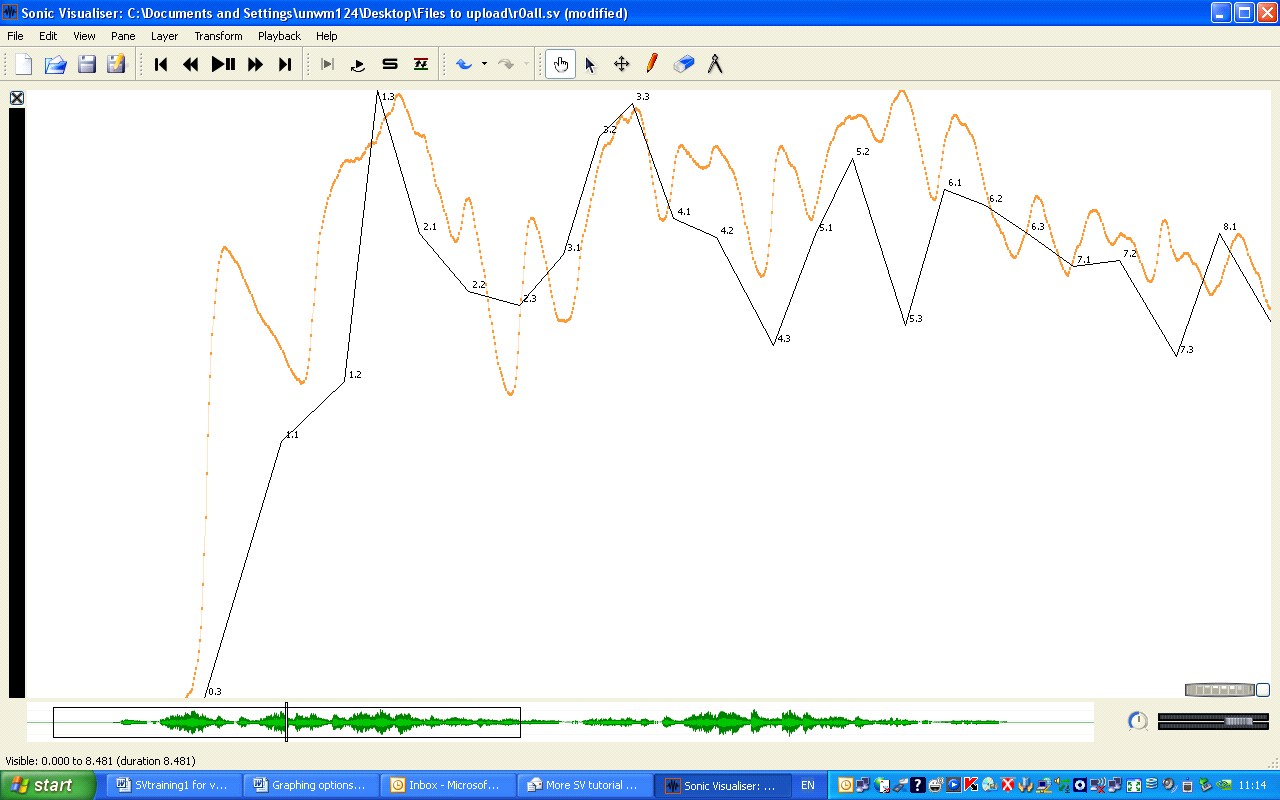
Although the waveform provides an indication of dynamic values, it is not very easy to relate it to the tempo graph. Using one of the CHARM Mazurka project plug-ins it is easy to generate a dynamics graph to match the tempo one. To do this, go to the Transform menu and open Analysis by plugin name > Power > Smoothed power. Accept the default values in the dialog box that opens up, and a dynamics graph appears, as in the following screen shot—in which, for clarity, the waveform, beat lines, and even cursor (View > Show No Overlays) have been set not to show. The session file from which this is taken is r0all.sv; it contains everything I've talked about; if you want to see the waveform, View > Show Property Boxes, bring the waveform layer to the top and click on 'Show'.
Can we now see how Rubinstein uses tempo and dynamics in relation to one another? The overall impression is that faster goes together with louder, a standard performance technique for heightening the sense of phrasing; Rubinstein is clearly thinking of the music as two 8-bar phrases, and within those phrases the generally parallel shaping of tempo and dynamics is particularly clear in bars 5-8 and 13-15. But there are also long individual notes that don't correspond to the dynamics, such as on the second beats of bars 4, 5, and 7: the lengthening of these notes throws weight onto the following notes, which Chopin has marked with an accent, as well as contributing to the characteristic mazurka effect. Then in bar 8 Rubinstein prolongs the third beat, creating a local marker of the phrase repeat. In bar 10 he goes back to the second-beat lengthening (it is the same figure as at bar 4), but two bars later he again prolongs the third beat: this throws weight onto the downbeat at bar 13, from which point the phrases for the first time coincide with the downbeats rather than being syncopated against them. This allows Rubinstein to create the effect of an accent at the begining of bar 13 even though the dynamic level is low, again as specified by Chopin. In summary, Rubinstein uses tempo and dynamics together to create the phrasing, but prolongs individual notes quite separately from dynamics in order to create a variety of subtle effects of accentuation. The two graphs make it easy to ask—and answer—questions like this, and they also have the enormous advantage over conventional, printed graphs that you can look at them scrolling as you listen to the music; this helps to develop a sense of how graphs like this should be read. In addition, they provide a framework within which to interpret other performance data; you might for example now think of going back to Aubio Onset Detector to get at some of the timing detail between the beats.
-
- Sonic Visualiser graph 9
The traditional tapping approaches made it hard to go back to the music once you had generated a tempo graph, so that it became all too easy to think of graphs like this as the final point in the process. Using Sonic Visualiser, it makes sense to think of it exactly the other way round. With bar numbers, tempo and dynamics graphs, and perhaps a number of aligned recordings, you have an environment in which you can start the productive work of performance analysis.
Exporting data for graphing and further analysis
Despite the advantages of displaying graphs within Sonic Visualiser, there will of course be occasions when you want to create conventional, printed graphs or use data from Sonic Visualiser in other applications, such as statistical packages. Exporting data is quite simple. To export beat timings, for instance, you bring the Time instants layer with the beat data to the top (if you have a lot of layers it's handy to click and unclick the 'Show' button to make sure you've got the right one); then click on File > Export Annotation layer, identify the directory where you want to save the file, and export it as a text file. If you now use Notepad to open the file, you will see that it contains a list of times and labels, starting something like this:
| 0.169795920 | 0.3 |
| 0.841723392 | 1.1 |
| 1.387845824 | 1.2 |
| 1.671836736 | 1.3 |
| 2.043333336 | 2.1 |
| 2.468548704 | 2.2 |
| 2.908299328 | 2.3 |
| 3.297233568 | 3.1 |
Sonic Visualiser's import and export facilities mean that instead of saving and opening a complete session, you can choose to save and open its individual components.
Exporting dynamic data is also possible: bring the dynamics (Power Curve) layer to the front and export it in the same way, and you will see a file that starts something like this:
| 0.004988662 | -54.9803 |
| 0.014988662 | -54.9052 |
| 0.024988662 | -54.7245 |
| 0.034988664 | -54.6303 |
| 0.044988664 | -54.5527 |
| 0.054988660 | -54.3552 |
| 0.064988660 | -54.0166 |
| 0.074988664 | -53.6353 |
While useful for some purposes, this does not yet enable you to create a standard tempo and dynamics graph, with the dynamic values sampled at each beat. If that is what you want, a further stage of processing is necessary, using online software created by the CHARM Mazurka project. Open the Mazurkas project webpage, click on 'Online software', and then on 'Dyn-A-Matic'. Following the instructions, insert the contents of the beat file into the upper section of the Dyn-A-Matic page, and the contents of the dynamics file into the lower section; then click on Submit. When the program has finished working, copy and paste the contents of the Results window into a Notepad file. It will begin something like this:
While useful for some purposes, this does not yet enable you to create a standard tempo and dynamics graph, with the dynamic values sampled at each beat. If that is what you want, a further stage of processing is necessary, using online software created by the CHARM Mazurka project. Point your browser at the , click on 'Online software', and then on 'Dyn-A-Matic'. Following the instructions, insert the contents of the beat file into the upper section of the Dyn-A-Matic page, and the contents of the dynamics file into the lower section; then click on Submit. When the program has finished working, copy and paste the contents of the Results window into a Notepad file. It will begin something like this:
###data-type: Global Beat Dynamics (0.2x2 smoothing; 100 ms delay)
###extraction-date: Thu Feb 7 07:05:20 PST 2008
| 0.17 | 73.6 | 0.3 |
| 0.842 | 67.7 | 1.1 |
| 1.388 | 82.8 | 1.2 |
| 1.672 | 85.9 | 1.3 |
| 2.043 | 82.4 | 2.1 |
| 2.469 | 76.3 | 2.2 |
| 2.908 | 78.6 | 2.3 |
| 3.297 | 73.1 | 3.1 |
The first column shows times, the second the dynamic value corresponding to that time, and the third the label. The lines beginning ### are comments: if you were to import the beat dynamics back into Sonic Visualiser (Import Annotation Layer, selecting 'A value at a time' and 'Time, in seconds' in the dialog box), then these lines would be ignored—which means you can freely add comments to your data files to avoid getting them mixed up.
But the main point of this exercise was to use the data in a spreadsheet or statistical package. We'll assume you're using Excel (2003 or similar), and we'll start by creating a tempo graph. Instead of the normal 'File > Open' command in Excel, import the data (Data > Import External Data > Import Data); accept the default values in the Text Import Wizard (Delimited, Tab, and General). The data should look more or less the same in the spreadsheet as in Notepad. Now calculate the duration of each beat by subtracting its onset time from that of the next beat. We can't teach you how to use Excel here, but in brief, type '0' in cell C1 (this value doesn't really signify anything, but means your Excel graph will come out the same as the Sonic Visualiser one); type '=' in cell C2, then click on cell A2, type '-' [minus sign], then click on A1; then select the bottom right corner of cell C2 and drag down to the bottom of your data, so copying the formula to all the cells. (You may find it helpful to open the Excel workbook r0.xls: the Data 1 sheet has all this done for you.) Now select the third column by clicking on 'C', at the top of the spreadsheet, and select Insert > Chart; in the first step of the Chart Wizard box, select the 'Line' chart type, and click your way through the rest. You should end up with a basic duration chart, like the image below (Chart 1 in the workbook): long beats are at the top of the chart. The Data 2 sheet contains an additional calculation to turn it into a tempo chart (with long notes at the bottom); both it and the associated chart (Chart 2) contain some formatting.
-
- line graph 10
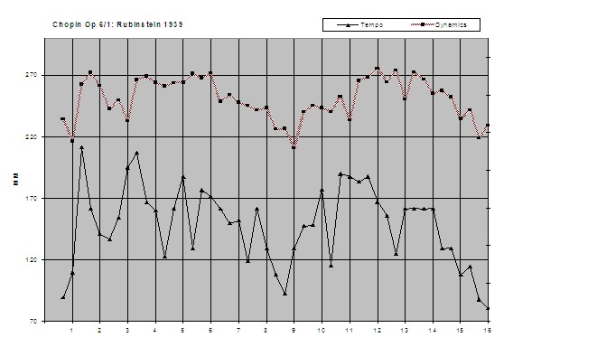
Creating a combined tempo and dynamics graph is more complicated. The Data 3 sheet is based on the Notepad file you created using Dyn-A-Matic (which contains the beat as well as the dynamic information), and should be easy enough to understand; the duration values are minutely different from before, because Dyn-A-Matic rounds the results. But explaining how to turn it into a graph would mean turning this into an Excel tutorial. Chart 3 (below) shows the finished result, and you can inspect the workbook to see how it is done. Note that the scale at the left relates to the tempo graph: the dynamic values are arbitrary, depending on things like the recording level, which is why no corresponding scale is shown on the right. And bear in mind that tempo has been graphed the same way as earlier, with the value appearing at the end of the relevant beat, whereas dynamic values are shown at the beginning of the beat. That's logical if you think about it, but if you find it confusing you can always change it: just delete E7 (shift cells up).
-
- line graph 11
Tempo mapping with spectrograms
Sometimes, when a performer is really wayward, deciding where the beats fall isn't as easy as it was in Rubinstein's recording of Op. 6 No. 1. A distinctly awkward example is the beginning of Elena Gerhardt’s 1911 recording of Schubert’s ‘An die Musik’ (accompanied incidentally by Artur Nikisch, who made the first recording of Beethoven’s Fifth Symphony in 1913): this is the file you saved as g.wav. The rubato here is so great that if you try to tap along in Sonic Visualiser you’ll probably end up with a pretty inaccurate result—which only increases one’s admiration for Nikisch who somehow manages to follow Gerhardt. Try it (Layer > Add New Time Instants Layer, tap the ; key): however much editing you do, moving the markers around on the waveform, it's likely that you’ll never be entirely satisfied.
You can get a much better result, however, if you use a spectrogram display, which shows not only the loudness of each moment but also the frequency of the sounding notes. That way you can see exactly where each pitch begins. We’re going to use spectrogram displays to look at other aspects of recordings in a moment, but you can also use them for tempo mapping. So click on Layer > Add Spectrogram. You will see a spectrographic display with your beats superimposed on it. Play it to see how this works. (If you don’t like hearing the beats clicked back at you, you can turn them off by pressing the green ‘Play’ button near the bottom right of the Sonic Visualiser window. Or you can change the click’s sound with the slider icon next to it.)
At the moment all the useful information about Gerhardt’s performance is near the bottom of the screen – because it’s mostly below 4kHz (due to the limited frequency response of the 1911 acoustic recording). You can get a better look at it if you use the vertical grey knurled wheel in the bottom right-hand corner of the spectrogram. (You’ll need to have the Spectrogram layer on top to see this.) Using the mouse, turn it gently downwards. You’ll see a lighter grey box appearing in the column immediately to the left of the wheel. Keep dragging until that box is about a quarter of the height of the whole column. Let go. Then drag that light grey box down to the bottom of its column. What you’ve done is to reduce the height of the visible spectrum, and then you’ve chosen the bottom part of the spectrum to be visible. On the far left of the display you’ll see the frequencies annotated. As long as you can see up to about 4000 you’ll have all the information you need.
You can change the horizontal spread of the spectrogram using the horizontal knurled wheel in the bottom right corner. Move it a little to the right and you’ll get more detail on the time axis. This will be useful in a moment when you start aligning beat markers with note onsets. You’ll notice that the screen is very unclear now, with what looks like torrential rain pouring down on the musical information. This is all noise from the 1911 recording. You can improve things by changing the settings in the boxes towards the upper right-hand corner of the Sonic Visualiser window. Set ‘Scale’ to dBV^2. Set ‘Window’ to 2048. Change ‘50%’ to 75%. Then put the mouse over the top-right round dial. It’ll label itself ‘Colour Rotation’. Drag that upwards until the indicator line is at 9 o’clock (alternatively, double-click on it, insert the value 42 and click OK). You should now have a much clearer spectrogram to look at. You can change these settings in any way you like, until you’re satisfied. All being well you should end up with something like the following.
-
- spectrogram 12
Back to mapping Gerhardt’s rubato. Now you can see where the piano notes start, and where the vocal notes change. They’re not always in the same places, and you’ll need to choose exactly where to mark the onsets of at least some of the beats (‘hol-’ of ‘holde’ – the first long note in the screenshot above -- is a particularly difficult one). Again, try to put the markers where you hear a beat (the clicks help here), even if it looks wrong—though you should find that in this display it mostly looks exactly right. Seeing the notes as frequencies really does help, because what you’re looking at here is really a kind of super-score, showing not just the pitches and notional durations but everything that the performers do in sound.
If you're having problems, delete your Time Instants layer, and load ours: to do this, select 'Import Annotation Layer' from the File menu, and select g.svl. Now, if you click on the Time Instants tab near the top right of the screen (this should be tab 5, if you deleted yours), you should see the beats marked on a moderately clear spectrogram display - moderately clear given that this is a very old recording with a lot of surface noise that the machine faithfully records. Now you can extract the data from the Time Instants layer and proceed with the tempo graphing. Select the tab for the Time Instants layer. Edit > Select All. Edit > Copy. Layer > Add New Time Values Layer. Edit > Paste. In the dialogue box select ‘Duration since previous item’. Your tempo graph should appear. (By all means try the other options in the dialogue box, opening a new time values layer for each, and see what happens. Choosing ‘Tempo (bpm) based on duration since previous item’, for example, will give you a graph that goes up to get faster and down to get slower.) Finally, use Layer > Add New Text Layer to add in the words at the appropriate places: ‘Du holde Kunst, in wie viel grauen Stunden’. If you place them inaccurately you can move them by using the crossed-arrows edit tool, just as for the time instants. Or, in a new Sonic Visualiser window, just open gg.sv.
If you work your way along the tabs at the top right you should be able to assemble a composite picture that superimposes a tempo graph on the waveform, spectrogram and text. Incidentally, if you find you don’t need the waveform any more you can delete it.
Reading spectrograms
Where spectrograms really come into their own is in the analysis and interpretation of expressive gestures at a relatively detailed level. Because they show the frequency and loudness and length of every sound, spectrograms make it possible to see exactly what performers are doing, and from there to start to think about what it all means for the way we understand the music. First of all, though, we need some introduction to spectrograms, their capabilities and their limitations. Then we’ll be in a better position to interpret what we see. We’ll start with a very basic description of what you can see in two related examples. If you’ve seen enough spectrograms to understand this already, then skip to the discussion of the second, which introduces some useful information about the spectra of words.
Download the Sonic Visualiser session for an extract from Heifetz’s recording from about 1926 of Schubert’s ‘Ave Maria’, arranged for violin and piano, at h.sv. Click on the tab for the Spectrogram layer to check the display settings, which should be much the same as for the last example. As usual the horizontal axis is time (this file lasts 20 seconds, which will give you an idea of the scale); the vertical axis shows frequency, indicated by a scale in Hz on the left. (By default middle A is assumed to be 440Hz, but you can change that – if you’re working with a performance you know was pitched differently – by going to File > Preferences > Analysis.) In addition, loudness is shown as colour, from dark green for the softest, through yellow and orange, to red and finally black for the loudest sounds: you can see the scale for that on the left, too (the figures there are decibels or dB, a measure of sound energy). What you can see here is a map of all the frequencies louder than about -50dB. In fact most of the musical sounds shown are louder than about -30dB, the rest is surface noise from the 78rpm disc which in this example looks like a green snowstorm in the background.
Try to ignore the snowstorm and focus on the musical information – the straight and wavy lines in brighter colours. The straight lines nearer the bottom of the picture are frequencies played by the piano, though the first note of the violin part is pretty straight too since Heifetz plays it with almost no vibrato. All the wavy lines are violin frequencies, wavy because of the vibrato which is typically about 0.75 semitones wide. So although the violin and piano frequencies are displayed together, the violin vibrato makes it fairly easy to tell which notes are which. The violin is also much louder most of the time, especially because its notes don’t die away as the piano’s do, and that means that it produces more high frequencies, which you can see higher up in the picture. The bottom of the picture is more confused, which is quite normal because the fundamentals are relatively close together. (We can alter this in Sonic Visualiser by selecting ‘Log’ instead of ‘Linear’ in the box on the far right: that produces very wide frequency lines at the bottom, but at least you can see more easily where the notes are on the vertical axis.) Of course it’s along the bottom that the fundamentals are shown: apart from a certain amount of rumble produced by the recording process, which you can see right along the bottom at 21Hz, the fundamentals will normally be the lowest frequencies present and the ones you perceive as the sounding pitches. All the rest of the information on the screen is about the colour or timbre of the sound.
You should be able to see without too much difficulty that the piano is playing short chords on fairly even (quaver) beats—look at the region between 400 and 500 Hz—and because the display is set up to show evenly spaced harmonics, rather than evenly spaced frequencies, you can see the violin harmonics as evenly spaced wavy lines above. The piano harmonics, by contrast, disappear into the snowstorm much more quickly (though some are visible at about 600Hz and 750Hz). One feature that’s very obvious is Heifetz’s portamento sliding diagonally up the screen about three-quarters of the way through the extract. His vibrato is quite even horizontally (i.e. the cycle-length is fairly constant), and you can see that the frequencies between about 1500Hz and 2100Hz are louder than those immediately below and above. This is an important element in Heifetz’s violin tone in this recording. The fundamental and lower harmonics are obviously much stronger, giving the sound warmth, but these strong harmonics relatively low down in the overall spectrum give it a richness without the shrill effect we’d hear if these stronger harmonics were higher up. You can get a more detailed view of Heifetz’s timbre (in other words, of the relative loudness of the harmonics) by selecting Layer > Add Spectrum. This shows you the loudness of each frequency in the spectrum. There’s a piano keyboard along the bottom showing you the musical pitch of each frequency, and a loudness scale on the left. If you go back to tab 1, and set ‘Follow Playback’ to Scroll, and then play the file, you’ll see how the spectrum changes as the recorded sound changes. If you’re interested in more detail than you can absorb while wathcing the file play, then use the hand tool to move the spectrogram across the centre line and you’ll see the spectrum analysis change, telling you how the loudness of the partials is changing from moment to moment. In this example it’s relatively stable because Heifetz’s tone remains relatively constant. Most of the variation is due to the vibrato. But you can see how the relative loudness of each of the main partials (the fundamental and its harmonics) traces a similar downward slope from left to right. In other words, generally each harmonic is slightly softer than its lower neighbour. The exceptions come when Heifetz makes a note louder (so that the lower partials on the spectrogram display turn orange): then on this blue spectrum display you can see higher harmonics getting relatively louder (the peaks are higher up the screen), and of course you’ll also hear the sound get brighter when you play the file. If you find the spectrum analysis getting in the way you can open a new pane (Pane > Add New Pane) and add a spectrum layer there instead.
For detail of individual positions on the whole spectrogram move back to the spectrogram tab and select it. When this layer is on top you’ll find that at the top right of the picture you have quite a lot of numerical information about what’s going on in the sound at the cursor. As you move the cursor it will update itself. Mostly it’s expressed as a range rather than a single value. That’s because Sonic Visualiser is honest with you about the limits of its certainty (there’s more about this in the program’s online manual). Even so, they can be very useful if you want to know more about a particular point on the display.
Spectrograms and the voice
Now compare this example with John McCormack singing the same passage in a recording from 1929, with a delicious orchestral accompaniment. You can keep the previous files open, so that you can look at the recordings side by side, and start Sonic Visualiser again from your Start menu or desktop. Open mc.sv. The spectrogram settings are the same as before.
You can see through this comparison how the words make a very big difference to the sounding frequencies. Using Sir Walter Scott’s original English text, McCormack sings, ‘Safe may we sleep beneath thy care, Though banish'd, outcast and reviled’. His accent is not quite what we’d expect today; the text annotations in the Sonic Visualiser file reflect his pronunciation. The spectrogram shows information about the colour of his voice, but it’s extremely difficult to work out where that information is, because most of the patterning in the spectrum of his voice is information about his pronunciation of the words. Acoustically, vowels and consonants are patterns of relative loudness among the sounding frequencies across the spectrum. Vowels are made by changing the shape of one’s vocal cavity, and the effect of that is to change the balance of harmonics in the sound. That balance will remain the same whatever the pitches one may be singing. When singers want to change the colour of their voice they shift the vowels up and forward (brighter) or down and back (darker) in the mouth, and the spectrum changes as a result. So the visible information in this spectrogram is mainly telling us about the words McCormack is singing and about his pronunciation of them. You can see how similar the spectrum pattern is for the first two syllables, ‘Safe may’, whose vowels are the same, although ‘may’ is louder and so brighter on the screen. The same goes for ‘we sleep be-‘, and between ‘ee’ and ‘be’ you can just see the ‘p’ of ‘sleep’ as a vertical line, indicating the noise element in 'puh' (almost all frequencies sounding for a moment as the lips are forced apart by air). You can confirm this by adding a Spectrum layer and moving the display through some of these similar and contrasting vowels and consonants. You’ll see that the balance of the partials changes much more than it did in Heifetz’s performance.
You can get a feeling for the way in which changing the balance of frequencies changes the vowel if you imitate McCormack saying ‘air’ (of ‘care’) and then ‘ar’ (of ‘banished’, which he pronounces as something more like ‘barnished’)—‘air ar'—and feel how close those vowels are in the mouth. You’ll see what changes in the picture as you move from one to the other: just as the vowel moves back and down in the mouth, so higher harmonics are stronger in ‘air’ and lower harmonics in ‘ar’, and the effect is of lighter and heavier or brighter and warmer sounds respectively. Similarly if you compare yourself saying McCormack’s ‘(th)ough’ and his ‘ou(tcast)’, you’ll feel the movement of the vowel up the throat and the widening of your mouth, and it’s easy to sense how that produces the change you can see in the spectrogram: a small loudening of the harmonics from the third harmonic upwards, producing a slightly brighter sound compared to the dull warmth of ‘ough’ (though only slightly because McCormack’s ‘out’ is still quite round). It’s a useful exercise that helps to sensitise one to the ways in which harmonics colour sounds of all sorts.
Hearing through spectrograms
Now that we know something of what we’re looking at in spectrograms, it’s important to know, too, some of the pitfalls in reading them. First, although the computer maps the loudness of each frequency fairly exactly from the sounds coming off the recording—in an ideal recording situation showing how loud each sound ‘really’ is in the physical world—the human ear has varying sensitivity at different frequencies. Any textbook of basic acoustics includes a chart of frequency curves which shows just how much louder high and (more especially) low sounds have to be before we perceive them as equal in loudness to sounds in the middle. Our greatest sensitivity to loudness is in the 1-4kHz range (especially 2-3kHz): this probably evolved because that range was useful for identifying transient-rich natural sounds, helping our ancestors identify the sources of sounds in the environment accurately and quickly, but it now makes us especially sensitive to vowels in speech and tone colour in music. It's true that we seem to hear the fundamental most clearly: it’s not interfered with by the vibrations of the harmonics to the same extent as the harmonics are by other harmonics, and so it’s easier for our ears to identify with certainty. But strictly speaking, the loudest information is often from the harmonics. So that range between about 1-4kHz is important for the information it carries about tone, and we perceive it as louder than the computer does. Consequently a spectrogram doesn’t colour those frequencies as brightly as it would need to in order to map our perceptions.
Another thing to bear in mind is that the higher up the spectrum you go, the more the ear integrates tones of similar frequencies into ‘critical bands’, within which we don’t perceive independent frequencies. For example, a 200Hz frequency’s higher harmonics at 3000, 3200, and 3400Hz all fall within a single critical band (3000-3400), so for us are integrated, meaning they are not perceptibly different. There’ll be no point, therefore, in trying to attribute to small details within that critical band any effects we hear in a performance. On the other hand, the auditory system enhances contrasts between these critical bands, so some sounds that look similar in a spectrogram may be perceived as quite strongly contrasting. Moreover, louder frequencies can mask quieter ones, so that the latter don’t register with our perception at all. For all these reasons (and more), the physical signal which the computer measures is different in many respects from what we perceive. All this means that one has to use a spectrogram in conjunction with what one hears. It’s not something to be read but rather to be used as an aid to pinpointing features of which one is vaguely aware as a listener; it focuses one’s hearing, helps one to identify and understand the function of the discriminable features of the sound. In this role it’s the most powerful tool we have.
Mapping loudness with spectrograms
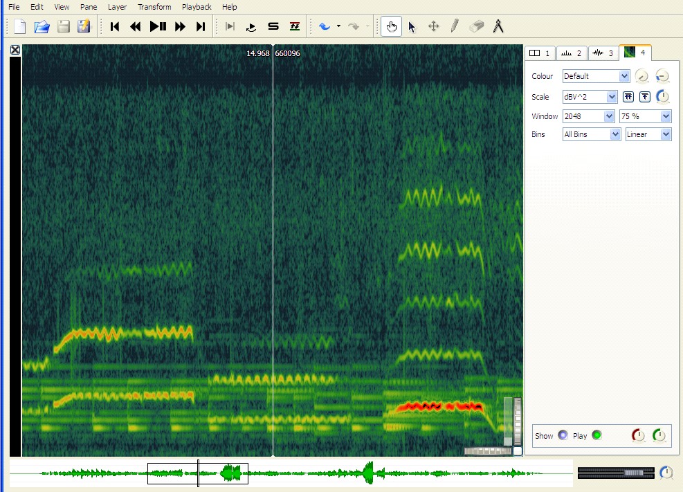
To make the point, open d.sv. This is the start of Fanny Davies’s 1930 recording of Schumann’s Davidsbundlertanz, book 2 no. 5, notable for its layering of melodic lines and dislocation of the hands. A spectrogram can help us study both features. This Sonic Visualiser setup tries to reveal the individual notes as clearly as possible, given the noisy recording. (The changed settings are Threshold -34, Colour Rotation 85, Window 4096, 75%, Log; with 2KHz for the vertical display (you can see and change this value by double-clicking on the vertical knurled wheel) and 44 for the horizontal, with the visible area set between 80Hz and 3kHz.) If you have the patience, you can use this to measure the exact timings and loudnesses of every note. Play the recording a few times to get used to picking out the three registral layers (bass, middle voice, melody). Then use the mouse and the readout in the top right-hand corner of the spectrogram to get the loudness of each note in dB, placing the cursor on the brightest part of the start of each note and reading off the values. Bin Frequency gives you the frequency of the segment the computer stores at the place indicated by the cursor, measured in Hz. Bin Pitch translates that into a letter name for the pitch with the distance from equal temperament indicated in cents (a cent is 1/100th of a semitone). dB measures the loudness in decibels: depending on where you put the mouse you may get a range instead of one reading.
For a visual impression of how loudness is changing, you can use the dynamics plug-in mentioned in the first part of this tutorial (Transform > Analysis by category > Unclassified > Power Curve: smoothed power). This will give you, as a new layer, a graph of loudnesses. You can change the graph’s appearance by making different selections at the top right. Try ‘Plot Type’ Lines, or Stems. You can read the loudness at the top of each of the peaks more easily than inside each of the notes below. If you want a smoother curve you can change the value of ‘Smoothing’ in the ‘Plugin parameters’ dialogue box (before clicking OK above): make the value much smaller (e.g. 0.02) and you’ll get a much smoother curve, which can be useful for general comments about how the overall loudness changes during a phrase. The following screenshot shows power curves at both levels of detail, the white Stems setting, with Smoothing at 0.02, providing a mountain-range map of general loudness change, and red graph, connected points at 0.2, showing how the arpeggiated and melody voices relate.
-
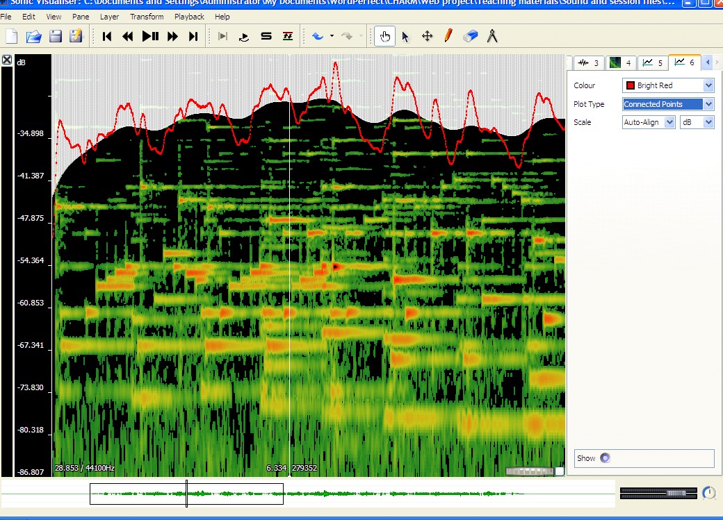
- spectrogram 13
Another plugin—Aubio Onset Detector, which we've already met—helps in marking the note onsets: Transform > Analysis by Plugin Name > Aubio Onset Detector > Onsets. You’ll need to play with the ‘Silence Threshold’ value so that it’s set loud enough to ignore all the softer sounds you don’t want marked. Try -60dB to start with. Remember you can add and delete time instants using the pencil and eraser menu icons. And you can export, edit and reimport the results, just like a layer you’ve tapped. Try some of the other plugins to see what they can do and how you can adjust them to get more useful results.
Returning to Fanny Davies’s performance, in fact the notes are not strictly layered in loudness nor as evenly played as you might think listening to the recording: the loudness of each needs to be understood together with its timing, which can also affect our sense of its weight—as of course does the compositional structure which gives notes different perceptual weight in relation to the surrounding melody and harmony. The bass line is consistently quieter, but the inner arpeggiated accompaniment is sometimes as loud as the melody: what makes the melody seem louder is its place at the top of the texture and at the start of many beats, whereas the middle voice tends to be quieter at the beginning of the bar and then to crescendo as it rises up the scale through the bar. None of this is at all surprising.
Much more interesting is Davies’s rubato, of which we can get a vivid impression by using Sonic Visualiser’s playback speed control. This is the dial in the bottom far right-hand corner. Move it back to about 10 o’clock (or double-click and set it to -230) and listen carefully. (You may find that the cursor trails behind at these slow speeds, so don’t be misled by it.) According to the score, the notes come evenly on successive quavers. Davies’s second quaver, the first of the inner voice, comes on what would be the fourth if she were playing in time at the speed she takes the inner voice once it gets going: this establishes an intention to linger at each new minim beat. After the second melody note she waits an extra quaver before continuing with the inner voice; later this gap becomes about a quaver and half, and now we can hear much more easily just how the inner voice waits for melody and bass at the top of the phrase, and just how much the arpeggiation of the left-hand chords contributes to this miraculously subtle performance. One could map this out as a tempo graph, but actually in this instance one learns a lot more simply by listening at a slower speed, focusing the attention of one’s ears on the placing of the notes one also sees. It’s a powerful aid to understanding.
Benno Moiseiwitsch was admired as a pianist for his ‘singing’ melodic playing; in the following example some of his melody notes actually get louder after they’ve been sounding for a while, which you might think impossible for a piano, but we can use Sonic Visualiser to see how it works. Load m.sv, which is from Moiseiwitsch's 1940 recording of Chopin’s Nocturne in E-flat, op. 9 no. 2. Click on the Measure tool (the pair of compasses) in the toolbar and move the mouse across the screen: you’ll see an orange ladder whose rungs mark the expected positions of the harmonics of the note at the bottom. If you move the ladder over the any of the crescendoing notes (e.g. at 11.5secs and 942Hz, 22.5secs and 942Hz, and 24.2secs and 624Hz), you’ll see that each is the fourth harmonic of a moderately strong fundamental (the fundamental is the first harmonic), whose overtones are apparently reinforcing the melody note, causing it to get louder again. Resonances are being set up which cause the melody string to vibrate more vigorously for a moment, and they may have partly to do with that particular instrument or even with the recording room or equipment: it’s interesting that the same B-flat figures twice, suggesting that one of the elements in the sound production is particularly sensitive to that frequency. So Moiseiwitsch’s skill in balancing harmonics may in this case be merely (or partly) an effect of chance. Nevertheless, the overlapping of melody notes, hanging onto the last for some while after playing the next, is very clear from the spectrogram and gives one useful insight into his piano technique.
It’s extremely easy to use Sonic Visualiser, or any program that gives a readout of frequency and timing, to measure vibrato and portamento. Let’s go back to the Heifetz example, h.sv. Select the Spectrogram tab, and using the Measure tool choose a long violin note with at least five full vibrato cycles at a harmonic that gives a large clear display – the cycles are going to be the same length and width whichever harmonic you take, so it really doesn’t matter which you choose. Click on the first peak and drag the mouse along five peaks (or more when the notes are long enough). When you let go of the mouse you’ll find that you’ve drawn a rectangular box. And if you pass the mouse over it again a lot of numbers will appear. Beneath the middle of the box the top number gives you the length of the box in seconds. If you’ve boxed in five cycles it will be around 0.78secs. Simple mental arithmetic tells you that each cycle takes about 0.16secs, which gives you Heifetz’s vibrato speed at this point.
Working out the depth is a little more complicated. You’ll probably need to make a new box for this. Use the cursor to select the top of a typical vibrato cycle (preferably the first of a range of typical-looking cycles). Then drag the mouse along to the bottom of a subsequent cycle. What you’re aiming for is a box that exactly encloses a sequence of vibrato cycles, its top line touching the top of the cycles, its bottom line touching the bottom. If you’re not happy with your box delete it using the delete key on your keyboard. When you’ve got the best possible fit note the numbers round the box. The figures for the top left of the box show the frequency in Hz of the top of the vibrato; the figures for the bottom right give the frequency in Hz for the bottom of it. They also show the pitch by showing the letter name, octave, and distance in cents (100ths of a semitone). You can use the two values in cents to work out the width of the vibrato. For example, if you have C6+33c for the top and B5+18c for the bottom, your vibrato cycle is 115 cents or 1.15 semitones wide. If you’ve chosen a more typical cycle you should get a figure of around 0.75 semitones, but Heifetz’s vibrato width varies expressively: depending on which note you’ve chosen, it may be anywhere between about 0.6 and 1.3. Clearly, to do this properly you need to measure more than one cycle. If you want an average then you’ll need to measure a great many, because vibrato in players born after about 1875 varies according to musical context; but if you simply want to observe that variation then a smaller number of readings chosen from the contrasting passages that interest you will suffice.
Portamento can be measured using the same tools. Here we’re interested in the pitch space covered, how long it takes, what shape of curve it is, and how the loudness changes during it. Working out the properties of the curve is not a trivial task, and for most purposes would be overkill, but spectrum displays can be very helpful in enabling one to understand the effect of portamenti in listening. Anything smaller than about 0.03secs is imperceptible, so may as well be ignored except as evidence of finger technique. The portamento slide in this Heifetz extract is very audible, at 0.25secs or thereabouts. It’s impossible to be precise about the length of a portamento—though with ‘All Bins’ changed to Frequencies you can try—because it emerges out of and continues into vibrato cycles: it’s impossible to decide when the vibrato stops and the portamento starts, or vice versa. There’s no point in worrying about these details. Spectrum displays make it all too easy to indulge in excessive precision that has no perceptual significance. But used sensibly they can teach us plenty about how vibrato and portamento, and a great many other expressive details, do their work.
A word about bugs
Compared to the programs we used to make do with, Sonic Visualiser is a marvel. But it’s quite new and there are still a few bugs. You can help iron these out by completing a bug report. Go to the Sonic Visualiser community page, click on ‘bug reports’ and register with SourceForge. It’ll only take a moment and your reports could be really helpful. When you’ve received an email back from SourceForge to tell you you’re registered you’ll be able to submit bug reports. First read the reports that are there already, in case yours has already been notified. You’ll see follow-up comments from SV’s authors, and if you submit reports yourself you’ll get an email when a follow-up comment is added to your report so you can see what’s being done about it.
Thank you. And enjoy Sonic Visualiser.